Chapter 2 EDA Lecture 1-2 R Examples
2.1 Example 2 - Gapminder
## Warning: package 'gapminder' was built under R version 4.0.4## # A tibble: 1,704 x 6
## country continent year lifeExp pop gdpPercap
## <fct> <fct> <int> <dbl> <int> <dbl>
## 1 Afghanistan Asia 1952 28.8 8425333 779.
## 2 Afghanistan Asia 1957 30.3 9240934 821.
## 3 Afghanistan Asia 1962 32.0 10267083 853.
## 4 Afghanistan Asia 1967 34.0 11537966 836.
## 5 Afghanistan Asia 1972 36.1 13079460 740.
## 6 Afghanistan Asia 1977 38.4 14880372 786.
## 7 Afghanistan Asia 1982 39.9 12881816 978.
## 8 Afghanistan Asia 1987 40.8 13867957 852.
## 9 Afghanistan Asia 1992 41.7 16317921 649.
## 10 Afghanistan Asia 1997 41.8 22227415 635.
## # ... with 1,694 more rows2.2 Frequency Distribution
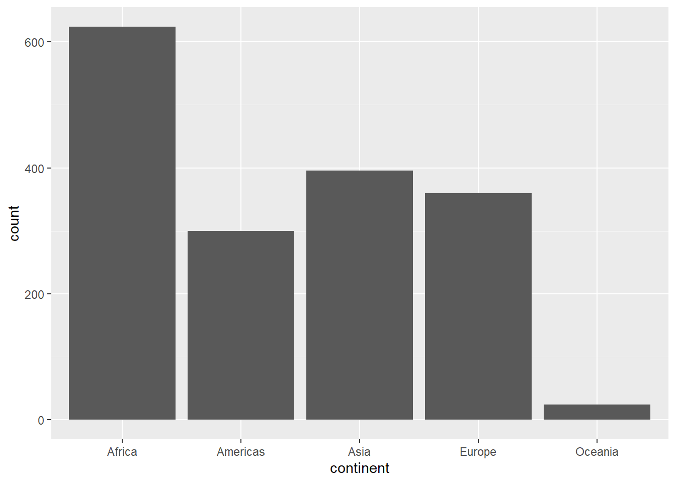
##
##   Africa Americas     Asia   Europe  Oceania
## 624 300 396 360 242.4 Pie Chart
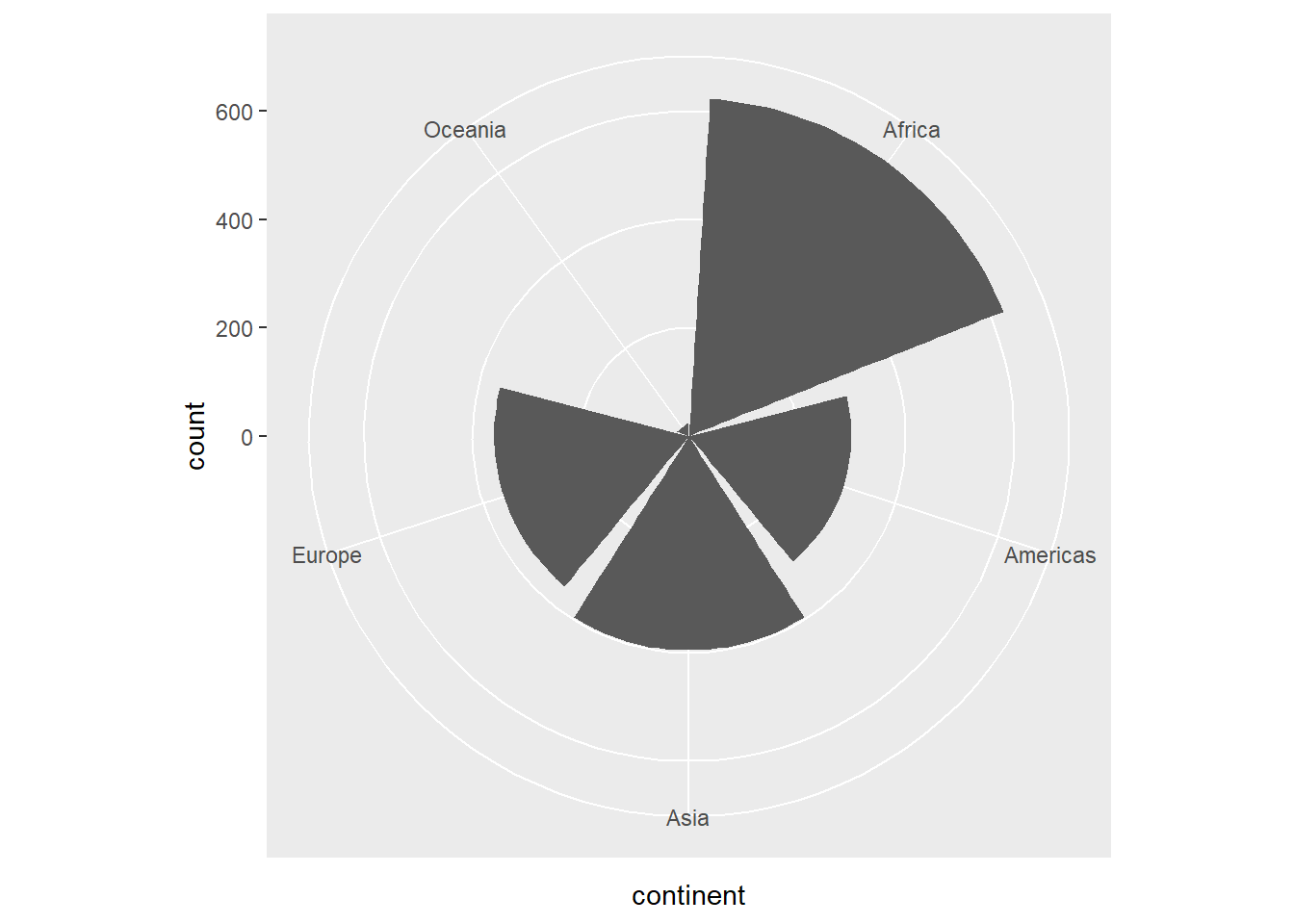 If you would like to have a regular pie chart, then you need to provide the frequency distribution.
2.5 Histogram
2.5.1 A Simple Histogram
library(ggplot2)
plot2 <- ggplot(gapminder,
                aes(x = gdpPercap))
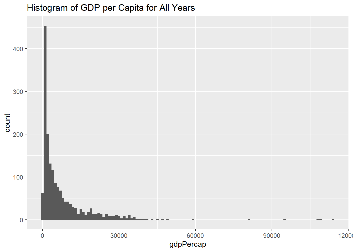
plot2 + geom_histogram(binwidth = 1000)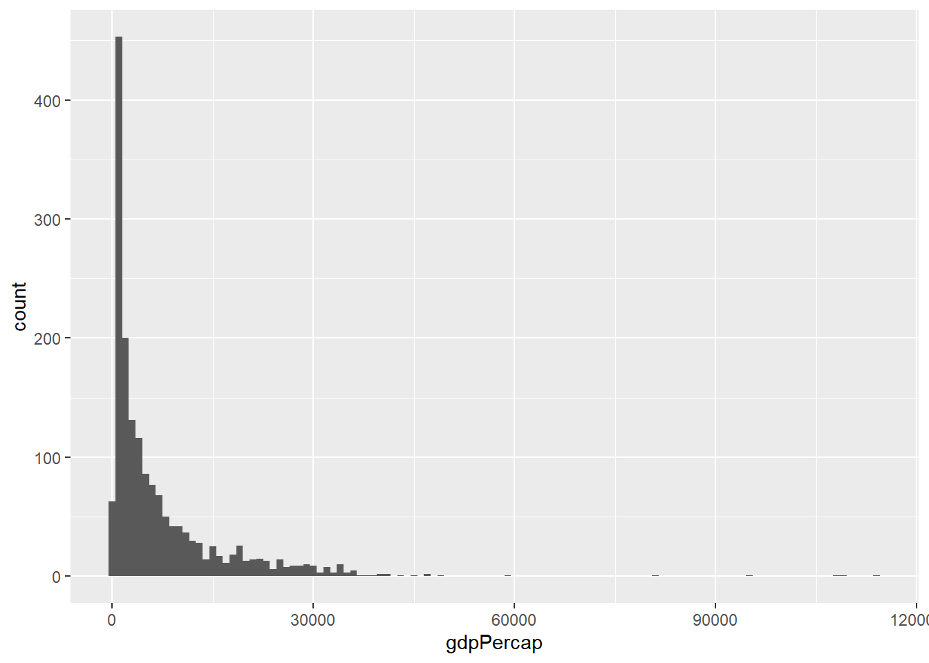
2.5.2 Histogram With a Title
2.5.3 Histogram with Different Color Schemes:
plot2 +
  geom_histogram(binwidth = 1000, color="black", fill="white") +
  labs(title = "Histogram of GDP per Capita for All Years")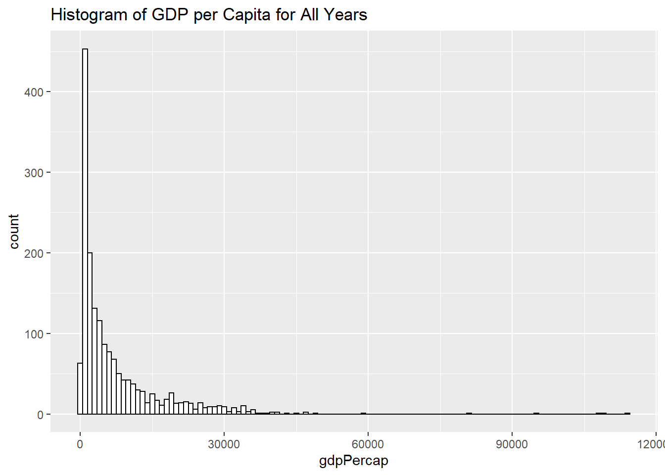
2.5.4 Histogram of Log Transformed Variable:
plot3 <- ggplot(gapminder,
                aes(x = log10(gdpPercap)))
plot3 +
  geom_histogram(binwidth = .2, color="black", fill="white") +
  labs(title = "Histogram of  Log Transformed GDP per Capita for All Years")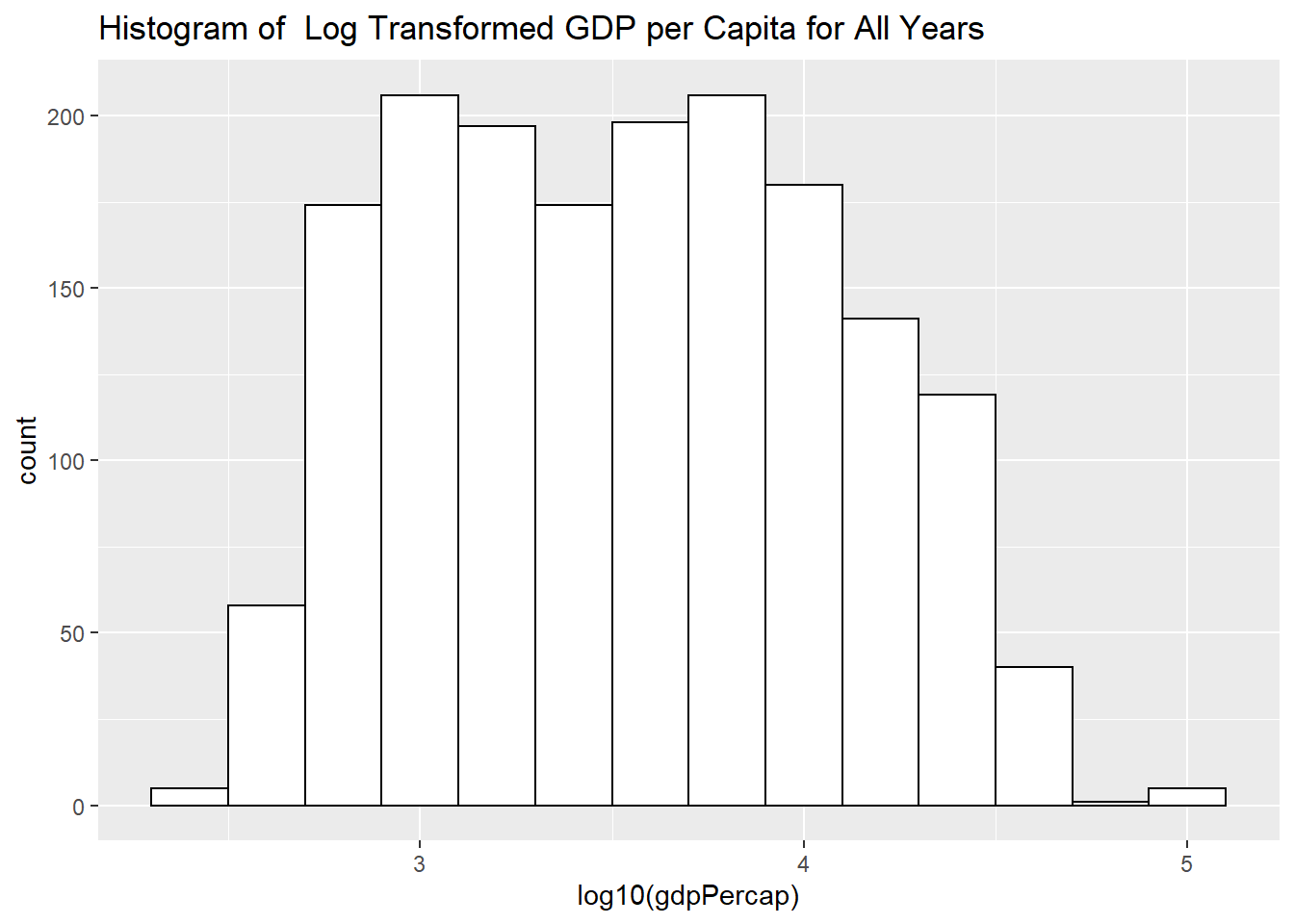
2.5.5 Determine the Binwidth
How do we determine the binwidth?So we can create our own function for the binwidth:
width_bin = function(x) (max(x)-min(x)) / sqrt(length(x))
manualbin = width_bin(log10(gapminder$gdpPercap))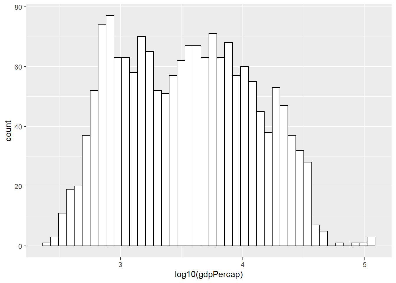
or simply
plot3 +
  geom_histogram(binwidth = function(x) (max(x)-min(x)) / sqrt(length(x)), color="black", fill="white") +
    labs(title = "Histogram of  Log Transformed GDP per Capita for All Years (Genstat Binwidth)")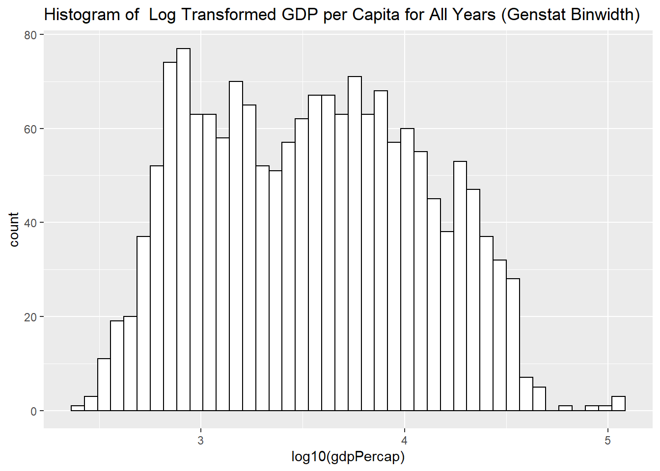
But you will notice that Gdp per capita variable includes all years, all continents, all countries!!!
2.5.6 Histogram for a Subset of Data
Log Transformed GDP per Capita for 2007:
plot4 <- ggplot(subset(gapminder, year == 2007),
                aes(x = log10(gdpPercap)))
plot4 +
   geom_histogram(binwidth = function(x) (max(x)-min(x)) / sqrt(length(x)), color="black", fill="white") +
  labs(title = "Histogram of  Log Transformed GDP per Capita for 2007 (Genstat Binwidth)")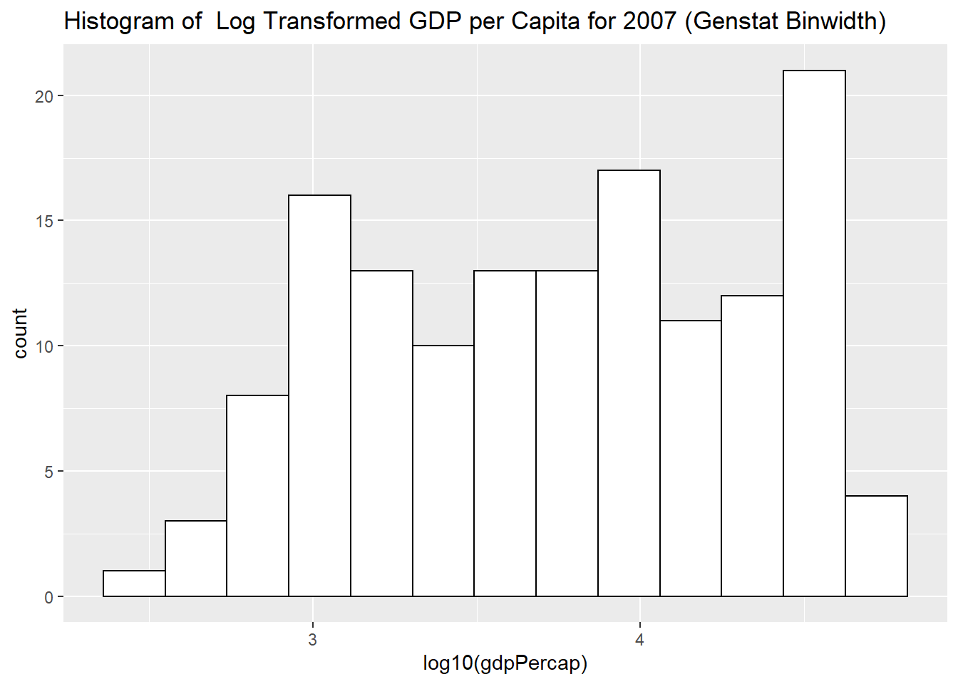
2.5.7 Histogram with Overall Mean Line
Log Transformed GDP per Capita for 2007 with the Overall Mean Line
# Histogram with mean of log10(gdpPercap) on the plot
plot4 +
  geom_histogram(binwidth = function(x) (max(x)-min(x)) / sqrt(length(x)), color="black", fill="white") +
  geom_vline(aes(xintercept=mean(log10(gdpPercap))),
            color="blue", linetype="dashed", size=1) +
  labs(title = "Histogram of  Log Transformed GDP per Capita for 2007 (Genstat Binwidth)")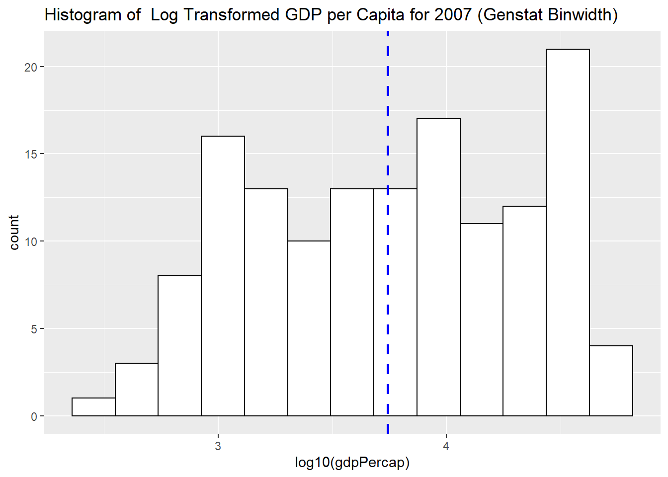
2.5.8 Histogram with Density plot
# Histogram with density plot
ggplot(subset(gapminder, year == 2007),
                aes(x = log10(gdpPercap))) +
  geom_histogram(aes(y=..density..), binwidth = function(x) (max(x)-min(x)) / sqrt(length(x)),colour="black", fill="white")+
  geom_density(alpha=0, fill="#FF6666") #alpha for transparency, if alpha = 0, no fill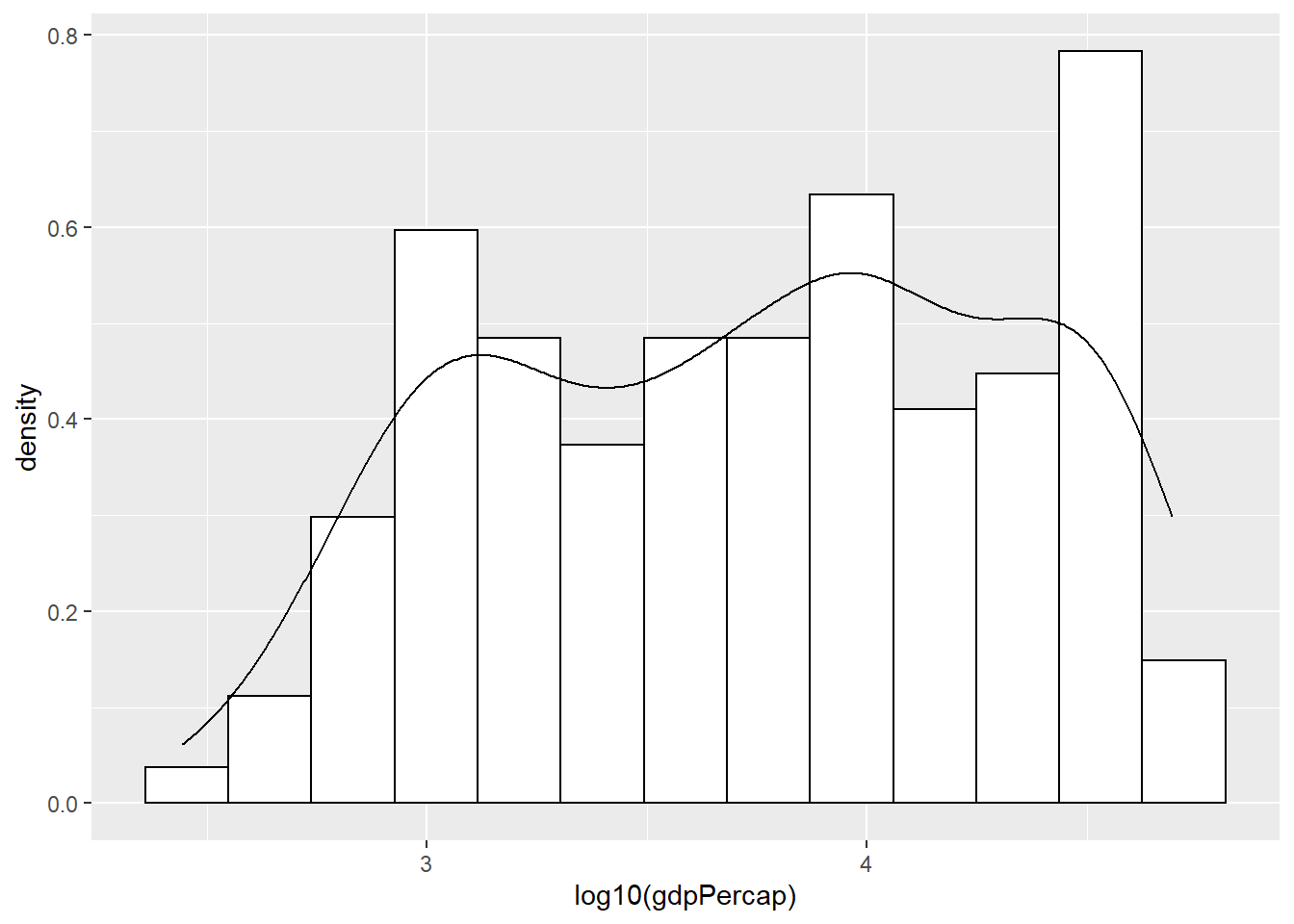
2.5.9 Histogram with Facets
How about looking at the differences among different continents?
# Histogram with mean of log10(gdpPercap) on the plot
plot4 +
  geom_histogram(binwidth = function(x) (max(x)-min(x)) / sqrt(length(x)), color="black", fill="white") +
  geom_vline(aes(xintercept=mean(log10(gdpPercap))),
            color="blue", linetype="dashed", size=1) +
  facet_grid(continent ~ .)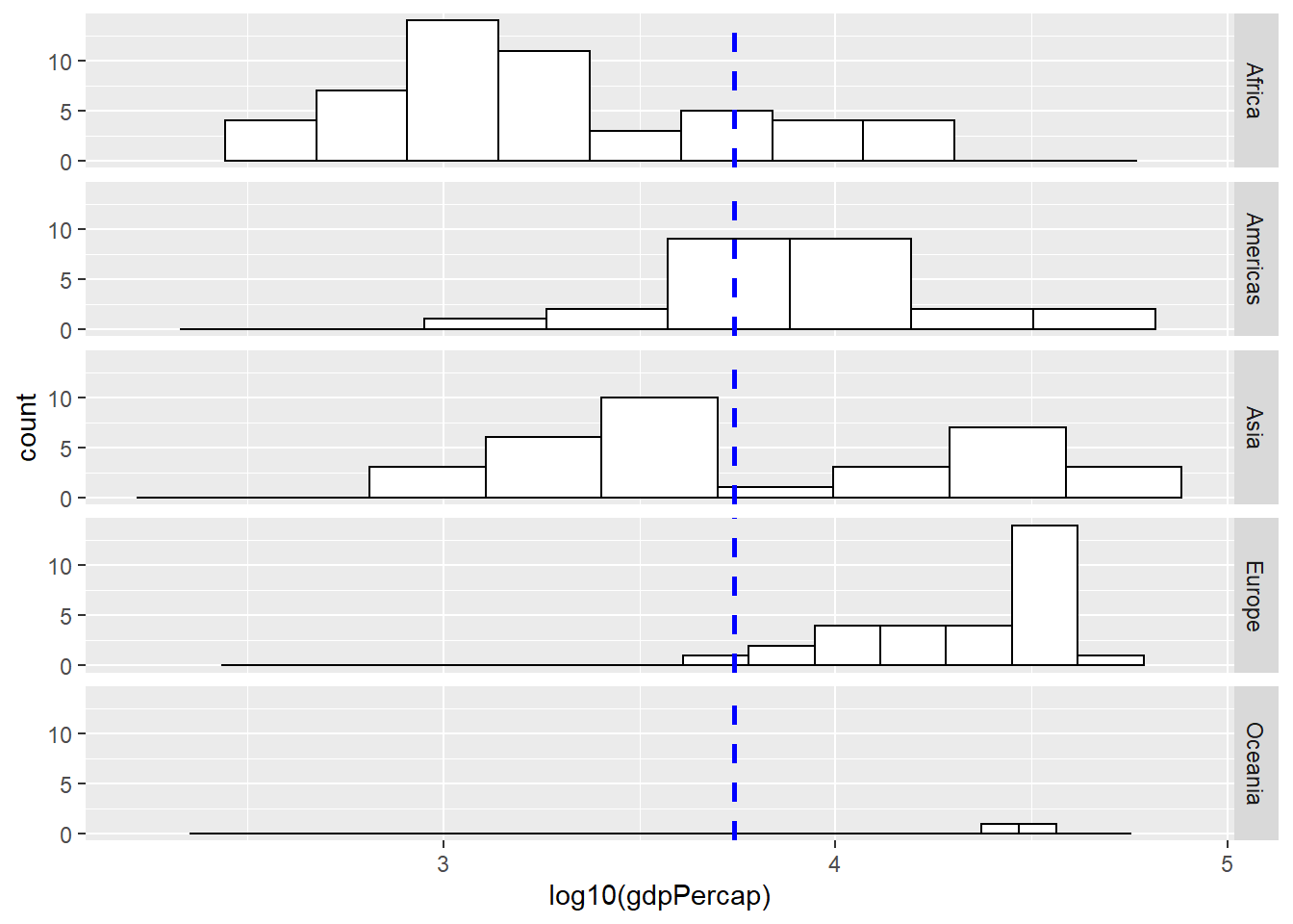
2.6 Boxplots
# Histogram with mean of log10(gdpPercap) on the plot
plot5 <- ggplot(subset(gapminder, year == 2007),
                aes(x = year, y = log10(gdpPercap)))
# if x axis variable is numeric, then one single boxplot
# if x axis variable is categorical, then works like facets

plot5 +
  geom_boxplot() #+ coord_flip()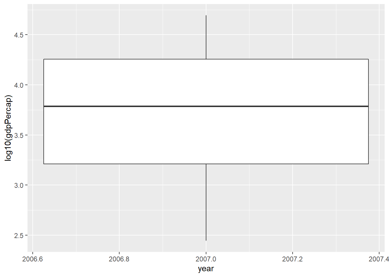
Try with ``continent" variable.
2.7 Scatter Plots
2.7.1 A Simple Scatter Plot
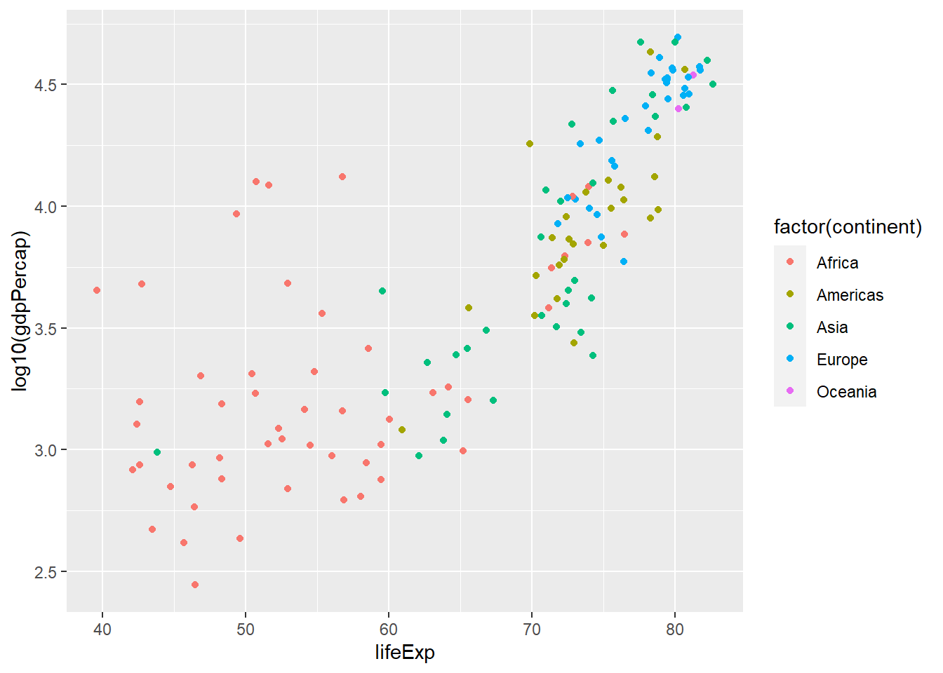
plot6 <- ggplot(subset(gapminder, year == 2007),
                aes(x = lifeExp, y = log10(gdpPercap)))
plot6 +
  geom_point()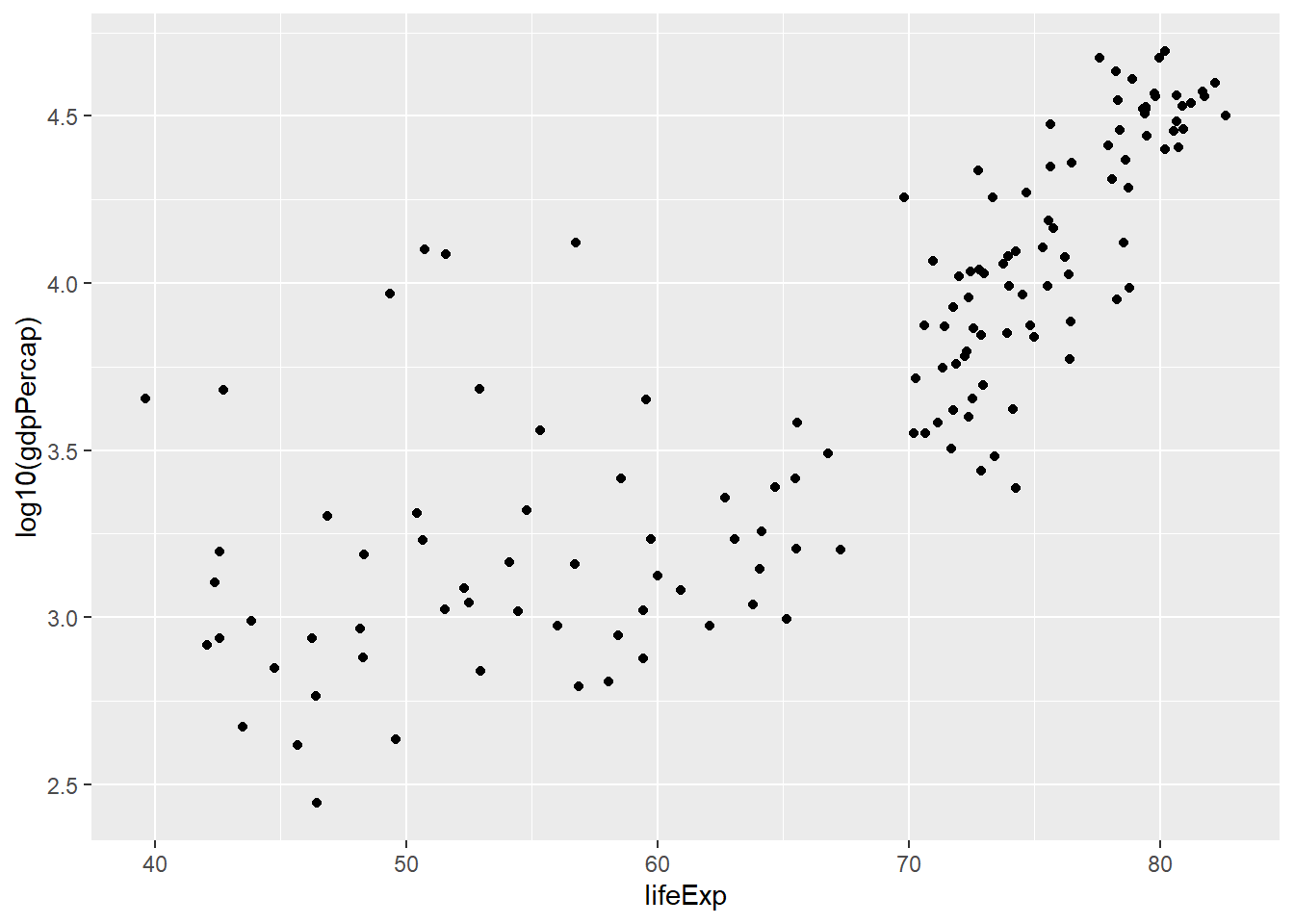
2.7.3 Scatter Plot with Linear Lines for Different Groups
plot6 +
geom_point(aes(colour = factor(continent))) +
geom_smooth(aes(group = continent, colour = factor(continent)), lwd = 1, se = FALSE, method = "lm")## `geom_smooth()` using formula 'y ~ x'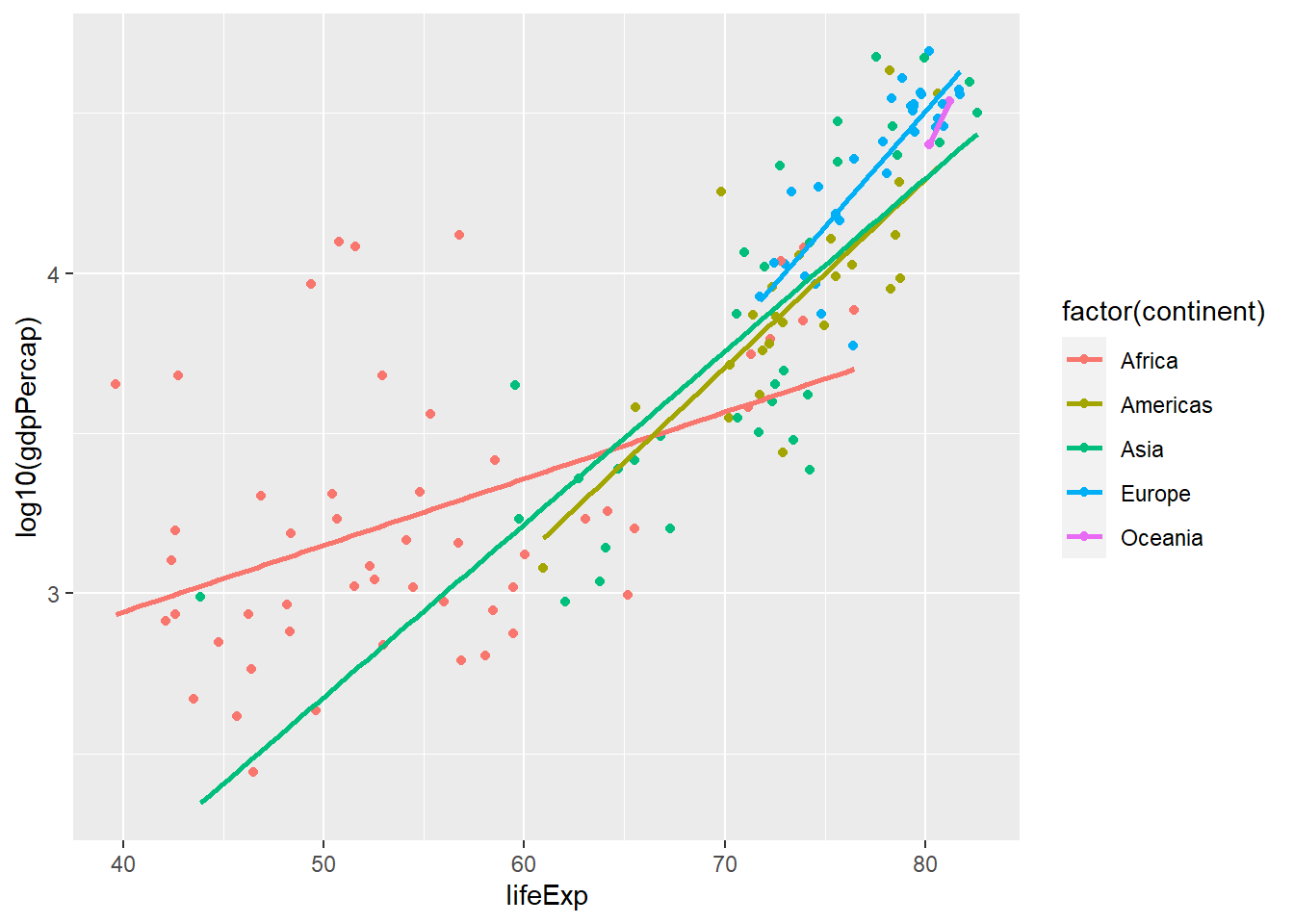
plot7 <- ggplot(gapminder,
                aes(x = lifeExp, y = log10(gdpPercap)))
plot7 +
  geom_point(aes(colour = factor(continent))) +
  facet_wrap(~ year) # scales = "free_x"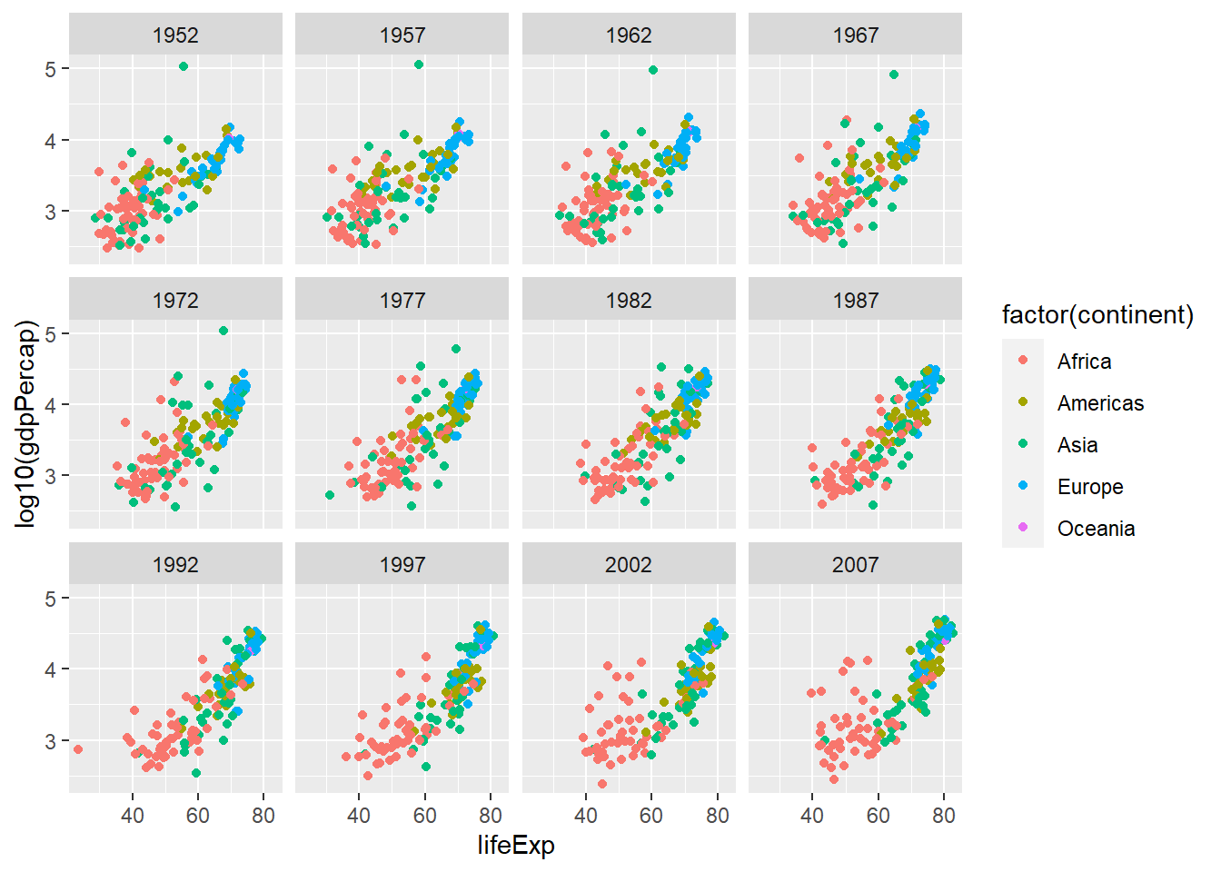
For more check ``ggplot2: Elegant Graphics for Data Analysis (Use R!)" by (Hadley Wickham)
